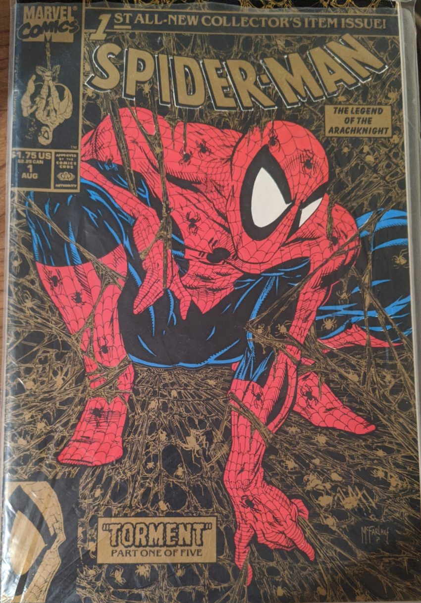
Welcome back to 1990! We’re here with Todd McFarlane’s Adjectiveless Spider-Man, the first comic since the 1940s to sell over a million copies. The message that sent was clear: Flashy art was all comics needed in the 90s. The insane sales success of Spider-Man #1 would be followed by similar numbers for Rob Liefeld’s X-Force #1 and far higher numbers for Jim Lee’s Adjectiveless X-Men #1. Part of these sales are driven by gimmicks, a relatively new concept at this time. Spider-Man #1 came in 3 covers. They were all the same drawing, but one was in regular color, one was silver, and one was gold. X-Force #1 came with one of several trading cards. You’d have to buy multiple copies to get them all. And X-Men #1 became the highest selling comic of all time in no small part due to coming in five different covers. 4 of them combined into 1 big image, while the 5th had a 4-part gatefold cover and a little bonus material in the back. It’s funny, 5 covers was outrageous for the time. Now a new #1 will have, like, 20, and yet only sell a hundred thousand copies. But it was novel back then, and predatory companies like “American Entertainment” took full advantage of stuff like this by selling slightly discounted packages of comics. “Get 3, 5, 10 copies of Spider-Man #1! You’re gonna need ‘em, because they’re gonna be worth a fortune!” Thus the speculator boom crept into comics after demolishing the baseball card industry, and by 1997, they’d demolished comics, too. Today, the regular cover version of this priceless heirloom can be had on eBay for like $6. Fun fact: I got the gold one, thinking it must be more special than the silver one or the regular one. But for some reason, gold was the 2nd printing. Conventional wisdom says a 2nd printing is all-but worthless, so lil’ comic collector me was bummed out to learn this, but as it turns out, the gold one is now worth more than the others, I assume due to a lower print run. I win! I could make as much as $20 sellin’ this bad boy. Not exactly the “put the kids through college” money speculators were promised, but fine by me.
This marked Todd McFarlane’s writing debut. He’d made it known he wanted to control the stories he was drawing, and no one was gonna say “no” to him in 1990, so he left ASM to begin working on this. “The Legend of the Arachknight.” This is an utterly meaningless sideways reference to Frank Miller’s seminal Batman series, The Dark Knight Returns, and the references to that series will continue on all of this 5-part story’s covers. Why? Who knows? Because McFarlane considered DKR a highwater mark for comics and wanted some of that shine? I can’t really guess. I’m gonna tell you up front: As a writer, Todd McFarlane is a very popular artist. In some ways, this wasn’t fair to him. He’d literally had no published writing and now he’s doing the most anticipated comic of all time. Maybe they should’ve had him write a few months of some Z-List book to get his feet wet. But hubris and money will get you in over your head, so here we are. And to be honest, I read Spawn #300 out of morbid curiosity in 2019 and found his writing is still very bad decades and hundreds of scripts later. So strap in! McFarlane writes, draws & inks, and good ol’ Bob Sharen colors. Part of this book’s price tag being nearly twice that of a normal issue of its vintage was much better quality paper than most Marvel comics. So it looks a lot slicker than the rest of the books we’ll see in this block. After the first page being a montage of New York…
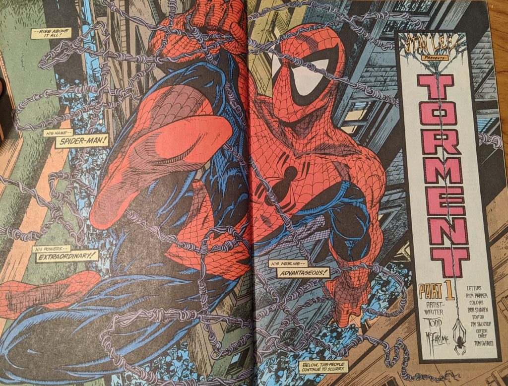
Guess who had this Spider-Man on a white t-shirt as a kid? I don’t talk much about lettering on here because I really don’t “get” it. Lettering is such a different discipline. I used to wonder why some cartoonists did literally every job in a comic except lettering until I started making comics, and then I got it. Lettering is hard, and the sign of a job well done is no one really paying attention to your work. But I will say that Rick Parker’s lettering always seemed a perfect fit for McFarlane. His title lettering looked like it could’ve been drawn by Todd, and I was pretty sure it was as a child until I saw comics he lettered that McFarlane didn’t draw. They were really simpatico. Anyway, under some really Frank Miller-y captions, Spider-Man interrupts a mugging.
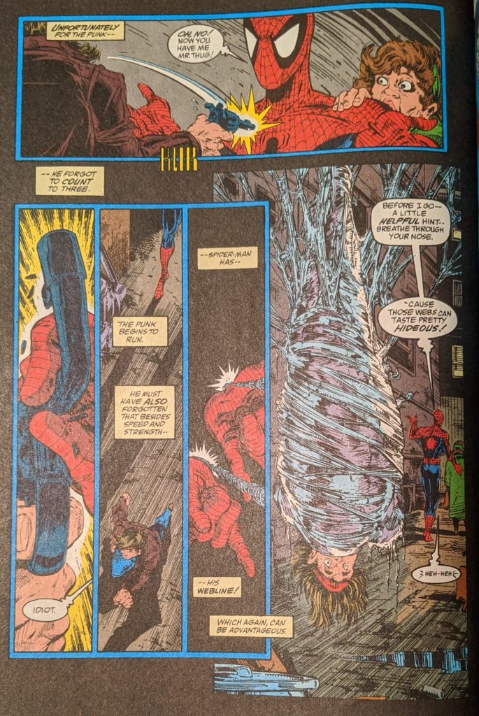
Why did the barrel bend up like that? He doesn’t seem to be doing it. Meanwhile, some real Kraven’s Last Hunt stuff is going on, as a shadowed figure uses drums and fire pits and other Kraven-ery to summon a monster from the East River. It’s… The Lizard. Why is The Lizard rising from the river like Godzilla coming out of the ocean? No one will tell us. Peter is back home now, talking to MJ about his night, talking about how he’s had hundreds or thousands of fights against big name supervillains.
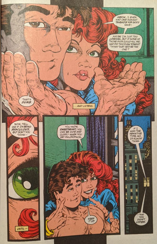
Ok… Cut to the drums making The Lizard kill a rat to eat until he spots some guys robbing a store. Cut to MJ tickling Peter to make him stop babbling about superheroing.
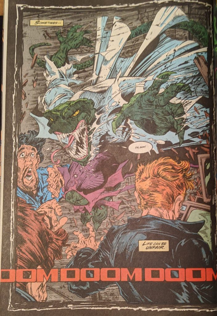
The Lizard shreds the goons, and then his mysterious controller pricks a finger to add blood to a cauldron, and a blood soaked Lizard kills some more dudes. The next morning, Peter heads out to finish up some lab work at ESU.
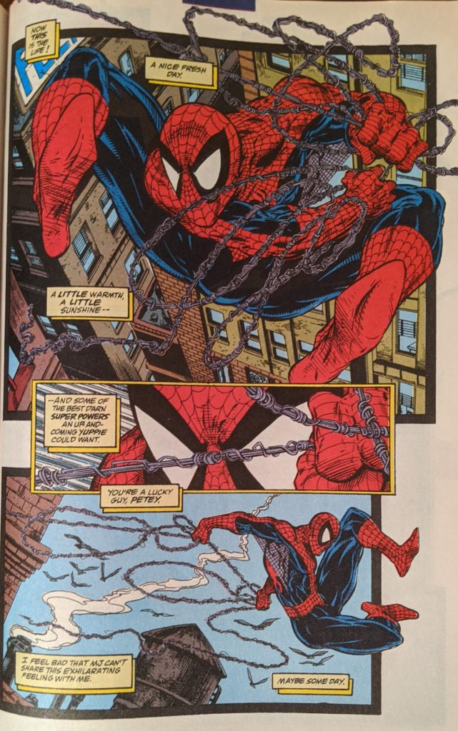
Now I have the proof that James Fry copied panels one & two on the same page in TAC 213. I have a bizarre, encyclopedic knowledge of every Spider-Man I’ve ever seen, especially when I was young, I can usually source a lift instantly. People have commented on how weird this is multiple times. It’s my super power. Panel one and the following splash page were also later bllllatantly ripped by Sana Takeda in a 2000s issue of Ms. Marvel. Talk about an artist who transformed completely. Those crude Ms. Marvels might as well have been a different person compared to her gorgeous work a decade later on Monstress. Anyway. McFarlane is ahead of his time on the captions here. In the 2000s, caption boxes would completely replace thought balloons, but still serve basically the same purpose. Somehow, comics agreed a box shape looked more grown up. We jump ahead to nightfall, as The Lizard kills again. Except the final page kinda makes it seem like we’re still following Spider-Man in the morning and The Lizard at night.
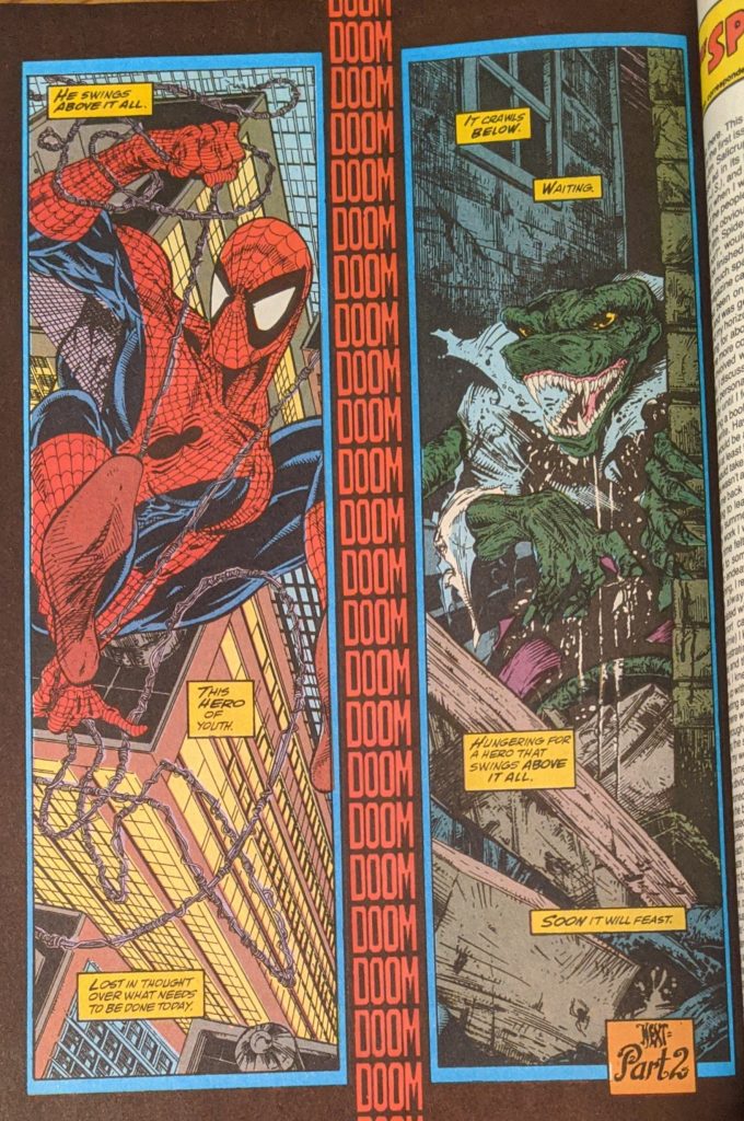
/shrug I dunno, man. So, there you go. McFarlane wants to be dark and artsy. The ball has only just started rolling. In place of a letter page, Todd writes a text page about how and why he’s doing this book, with tons of weirdly mean and unnecessary “joking” asides from editor Jim Salicrup. It’s pretty bizarre. He says he wanted to quit ASM because the summer schedule forced him to turn in weaker work, and that he really did think he’d get assigned some Z-list book to write, but Salicrup gave him this instead. He seems somewhat uncharacteristically humble about the whole process. Here’s the most important bit:
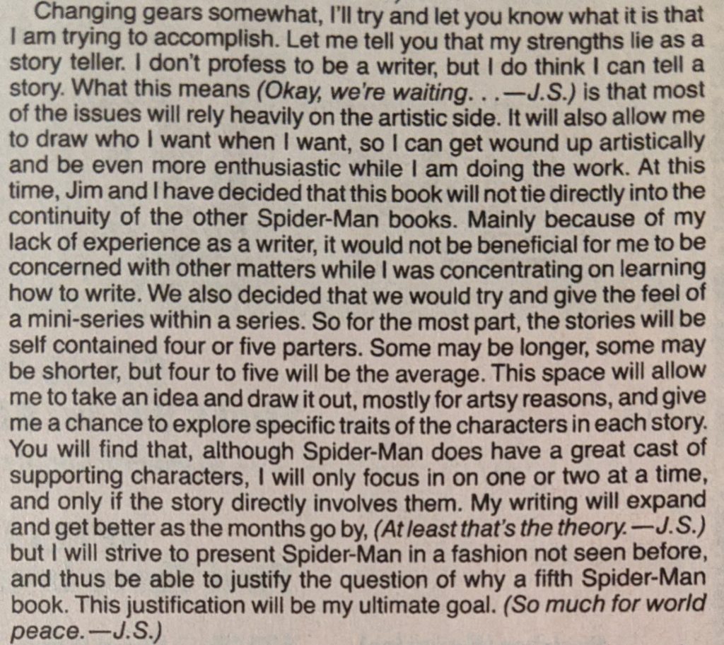
(5th because of Marvel Tales, the monthly Spider-Man reprint title) Weirdly combative stuff from Salicrup. So, Spider-Man is to be essentially a series of prestige miniseries all by the same writer/artist. We’ll see how that goes. By virtue of its place in history, this has become one of the most referenced covers of the last 30 years. Homages to it happen all the time. We’ve already seen one on that one Super Special. McFarlane himself is gonna do one on the cover of Spider-Man #13. But dozens of others have done it, too. For better or worse, it’s an iconic image.

