
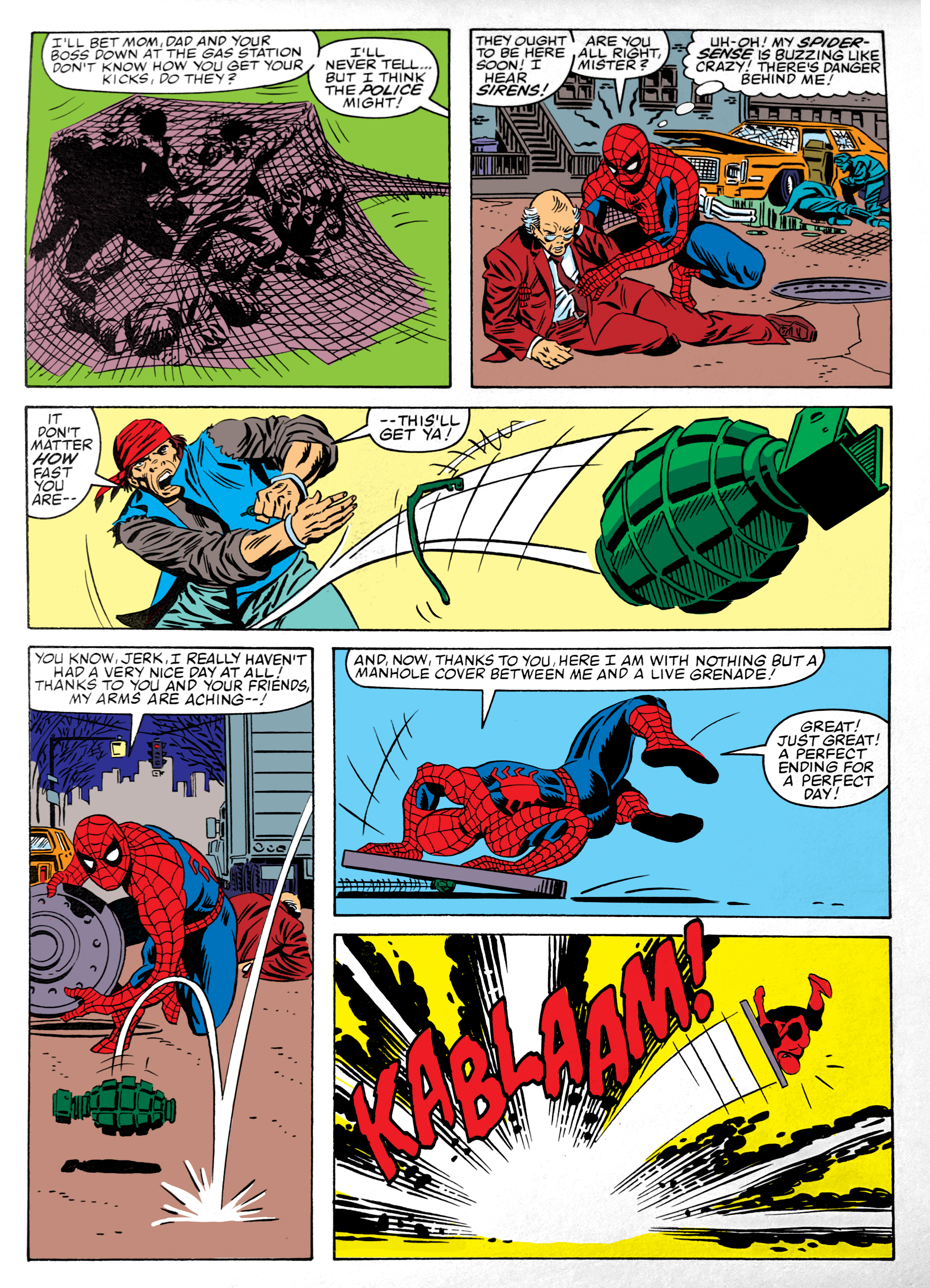
I mean, look at that crazy grenade sequence. Romita, Jr. is so good. These pages are still Shooter, Romita & Milgrom, but now the colors are provided by me. Comics in 1983 were still printed using the 4-color process, which resulted in a limited color palette. And before the advent of Photoshop, coloring was achieved by the colorist doing color guides by hand, coloring over a copy of the line art and then writing out what colors the printer should blend for each color on the page. Here’s an example I found from later in the the 80s:
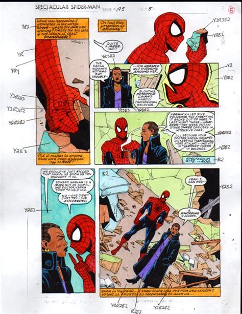
Why most superheroes are some combination of red, yellow and/or blue becomes pretty obvious looking at that, huh? Primary colors are a lot easier to get at in this methodology. This presented me with a bit of a challenge. I wanted to color this in period-accurate colors, but what do I know about that? Thankfully, there is Google. I found this post by Neil McCallister where he generated a set of all the colors possible in the 4-color printing method for Photoshop. Thanks, Neil! So armed, I felt confident that I wasn’t doing anything too obviously wrong.
Then there’s the art of coloring in the old days. These days, “realism” is everything, but back then, color could be (And often had to be) more abstract, more based on emotion or balancing the page. If that panel on page 3 in the previous post works best with a green background, well, it gets a green background. So I had to try to think in those terms instead of what makes the most sense realistically. I’m not sure how successful I was, but I did my best.
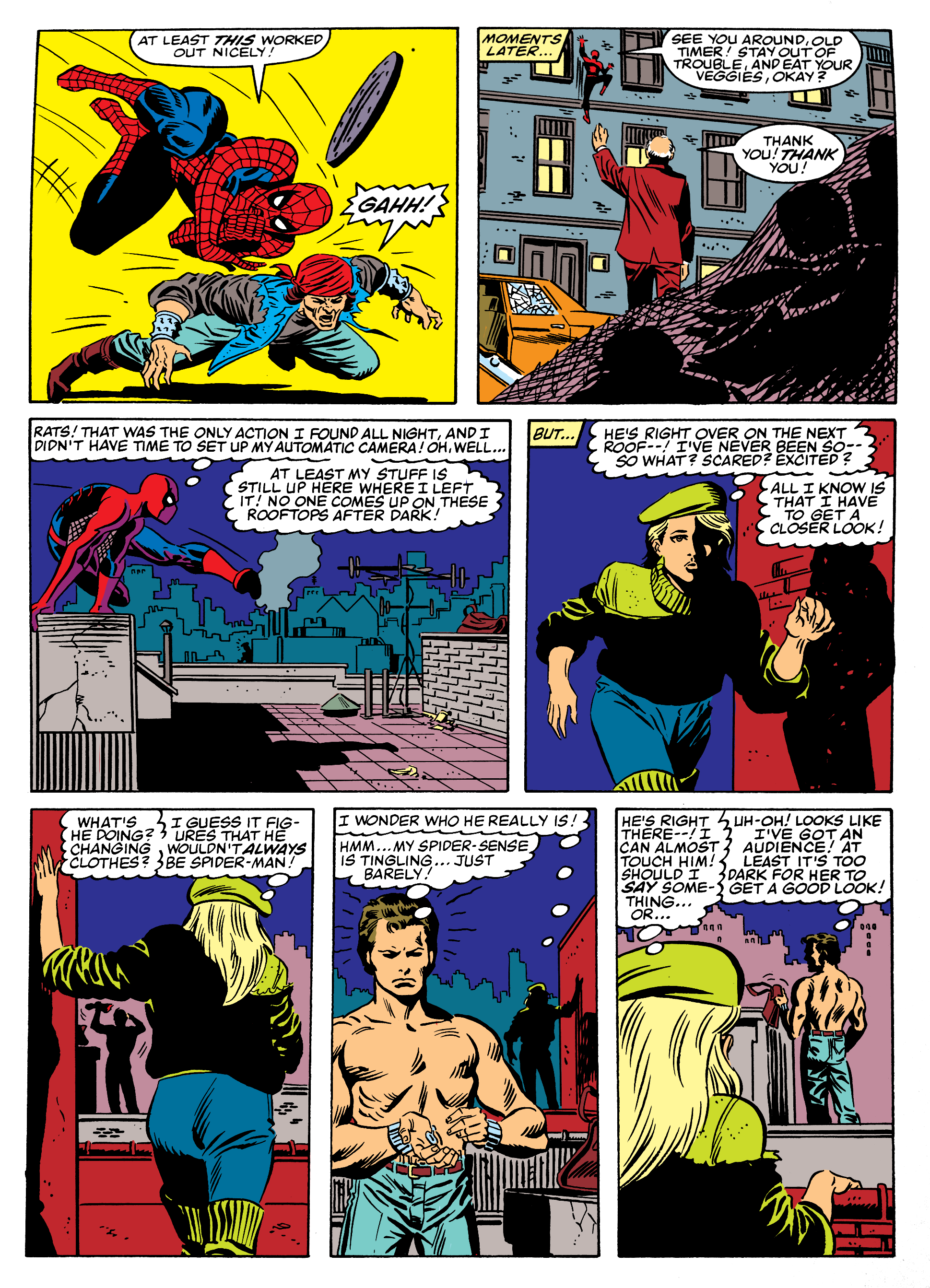
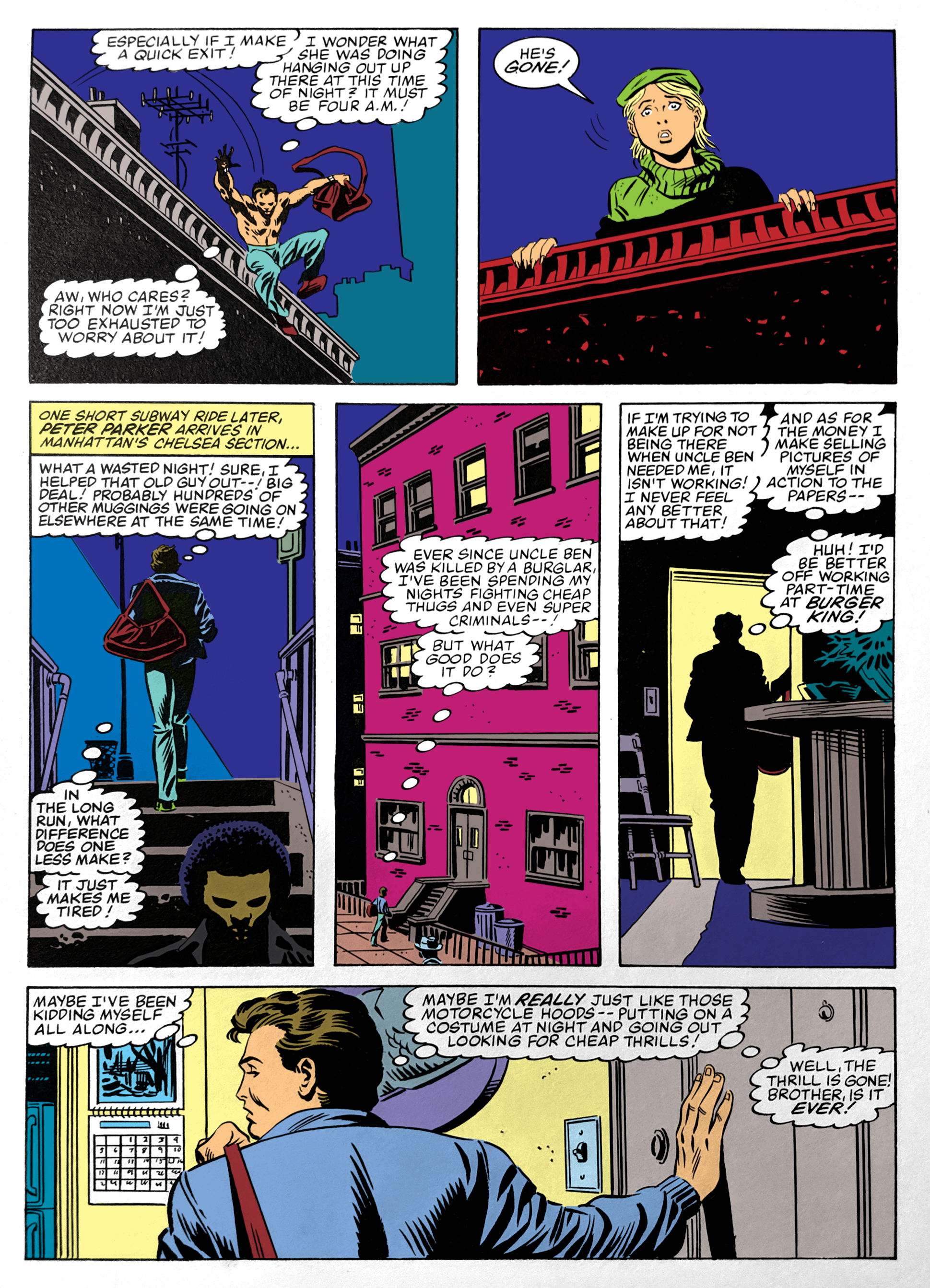
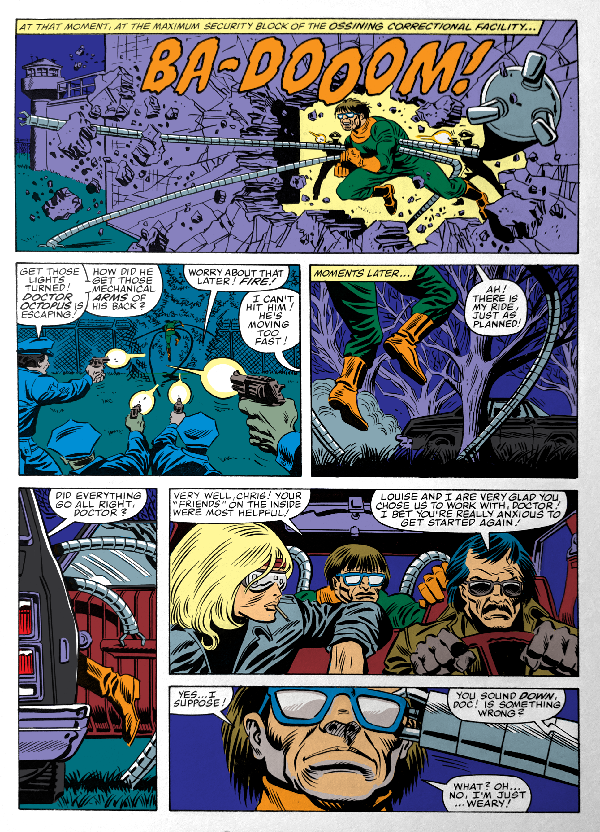
So! Doc Ock has broken out of prison! A girl has almost seen Spider-Man’s face! And Peter Parker seems to be having a real rough day. Tomorrow, I take over on inks, and now that I’m doing 2/3 of the art jobs, I’m switching to fewer pages per post for the rest of the book. See ya then.